Esto es lo que se dice masivamente en Internet. Parece que Wall Street no da más de sí…

Vienen curvas, o una sana corrección de al menos un 20%... hasta los 1.832 puntos. Todo lo que suba de aquí es insano…
Aunque yo dudo que sea así. Hay muy poca volatilidad y muy pocas alternativas de inversión. El mercado americano lleva muchas semanas parado y puede salir hacia abajo o hacia arriba, o seguir esperando a ver los efectos de las políticas fiscales de Trump… Recuerda que el mercado sube cuando hay “walls of worries” y esto es lo que hay ahora… Pero si corrigiese un poco sería saludable.
A Perspective on Secular Bull and Bear Markets
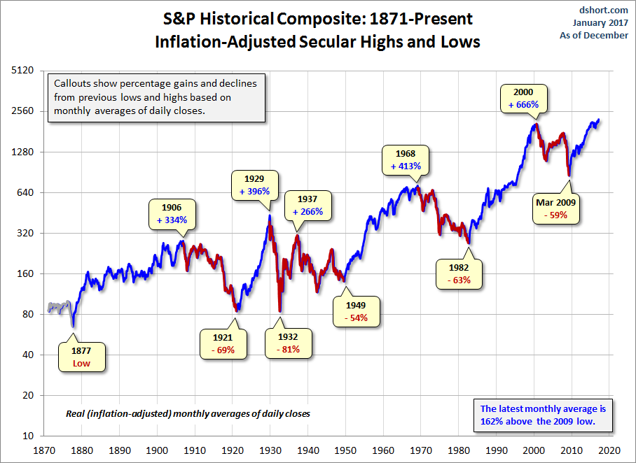
Was the March 2009 low the end of a secular bear market and the beginning of a secular bull? At this point, approaching eight years later, the S&P 500 has set a series of inflation-adjusted record highs based on monthly averages of daily closes.
Let's examine the past to broaden our understanding of the range of historical trends in market performance. An obvious feature of this inflation-adjusted series is the pattern of long-term alternations between uptrends and downtrends. Market historians call these "secular" bull and bear markets from the Latin word saeculum "long period of time" (in contrast to aeternus "eternal" — the type of bull market we fantasize about).

The key word on the chart above is secular. The implicit rule we're following is that blue shows secular trends that lead to new all-time real highs. Periods in between are secular bear markets, regardless of their cyclical rallies. For example, the rally from 1932 to 1937, despite its strength, remains a cycle in a secular bear market. At its peak in 1937, the index was 29% below the real all-time high of 1929. For a scholarly study of secular bear markets, which highlights the same key turning points, see Russell Napier's Anatomy of the Bear: Lessons from Wall Street's Four Great Bottoms.
An alternate view of secular trends is offered by Ed Easterling of Crestmont Research. See his fascinating study Understanding Secular Stock Market Cycles, which makes a persuasive case that we remain in a bear market that began in 2000. The underlying principle, in Easterling's view, is the price/earnings ratio, which remains lofty.
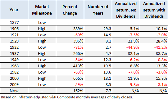
If we study the data underlying the chart, we can extract a number of interesting facts about these secular patterns (note that the table below includes the 1932-1937 rally):

Since that first trough in 1877 to the March 2009 low:
+Secular bull gains totaled 2075% for an average of 415%.
+Secular bear losses totaled -329% for an average of -65%.
+Secular bull years total 80 versus 52 for the bears, a 60:40 ratio.
This last bullet probably comes as a surprise to many people. The finance industry and media have conditioned us to view every dip as a buying opportunity. If we realize that bear markets have accounted for about 40% of the highlighted time frame, we can better understand the two massive selloffs of the 21st century.
Based on the real (inflation-adjusted) S&P Composite monthly averages of daily closes, the S&P is 162% above the 2009 low.
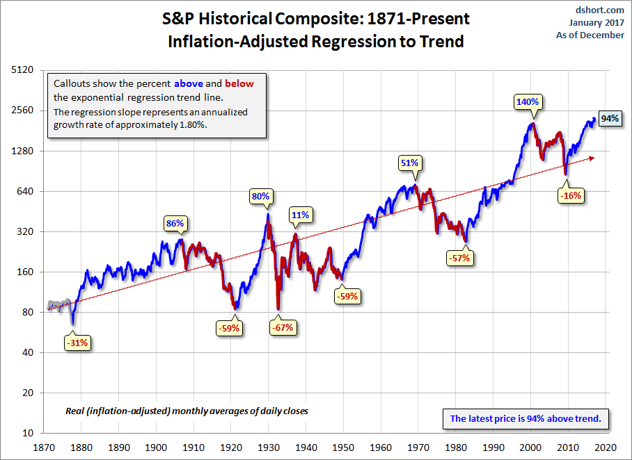
Add a Regression Trend Line
Let's review the same chart, this time with a regression trend line through the data.

This line is a "best fit" that essentially divides the monthly values so that the total distance of the data points above the line equals the total distance below.
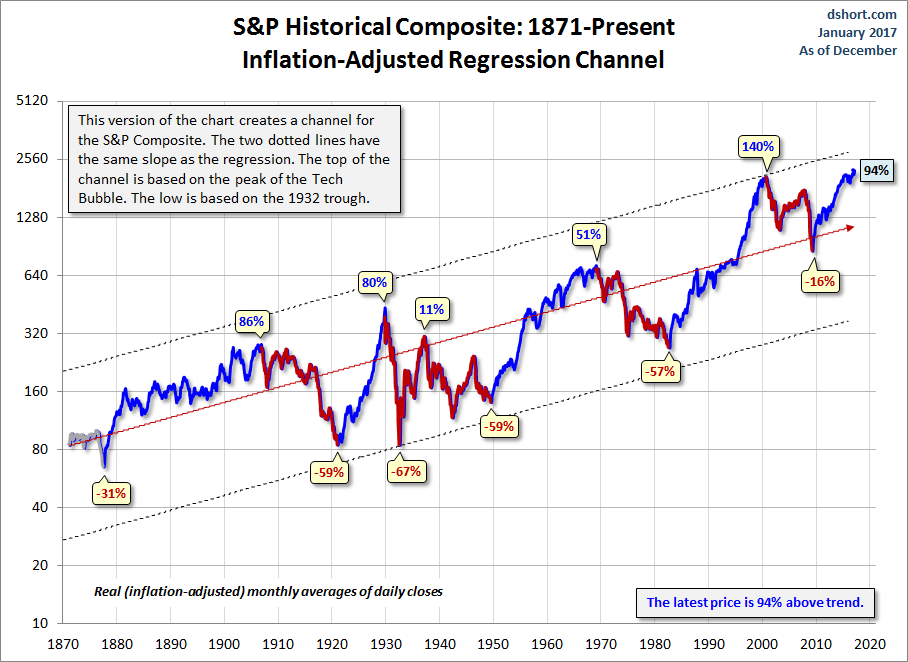
The chart below creates a channel for the S&P Composite. The two dotted lines have the same slope as the regression, as calculated in Excel, with the top of the channel based on the peak of the Tech Bubble and the low is based on the 1932 trough.

Historically, regression to trend often means overshooting to the other side. The latest monthly average of daily closes is 85% above trend, down from its interim peak of 90% above trend in December 2014. Is the recent decline a minor correction or a major reversal? It is perhaps important to note that the trough preceding the December peak had fallen only 15% below trend in March of 2009. Previous bottoms were considerably further below trend.
Will the March 2009 bottom be different? Perhaps. But only time will tell.
Note that in the charts above, we've color-coded the rally since the 2009 low in blue, implying the start of a secular bull. We did so because, in December of 2011, the real price achieved a new all-time high. But based on the underlying market valuation, one can make a strong case that the secular bear market hasn't ended. For a persuasive argument along those lines, see Ed Easterling's Are We There Yet? Secular Stock Market Cycle Status (PDF format) and/or contact Bob Bronson of Bronson Capital Markets Research.
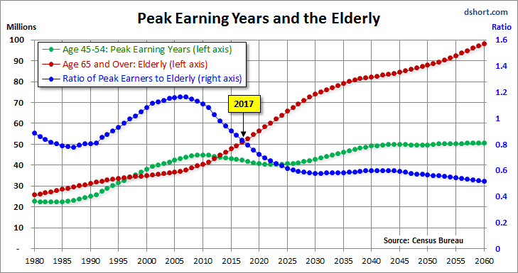
For a more optimistic view, see Chris Puplava's assertion in The Secular Bear Market in Stocks Is Over. Chris's commentary includes some interesting demographic analysis based on the ratio of the higher earning, bigger spending age 35-49 cohort to less financially empowered age 20-34 cohort. Unfortunately, this ratio is being savagely trumped by a far more powerful demographic shift: The ratio of the elderly (65 and over) to the peak earning cohort (age 45-54). The next chart, based on Census Bureau historical data and mid-year population forecasts to 2060, illustrates this rather amazing shift.

In the chart above, the elderly cohort (red series) is dramatically increasing in numbers. The ratio of the two, the blue line in the chart, peaked in 2007 and began its long rollover in 2008, coincident with the beginning of the last recession. We have many years to go before this ratio approximately levels out around 2030.
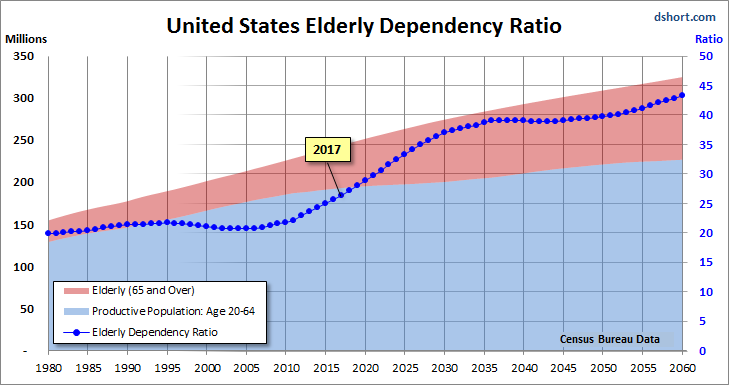
Even more disturbing is the elderly dependency ratio, the label given by demographers to the ratio of the 65 and older population to the productive workforce, which for developed economies is usually identified as ages 20-64. The next chart illustrates the elderly dependency ratio with Census Bureau forecasts to 2060. Note that in this chart we've followed the general practice in demographic research of multiplying the percent by 100 (e.g., the estimated mid-year 2016 elderly dependency ratio is 25.7% x 100 = 25.7).

As the chart painfully illustrates, the elderly dependency ratio is in the early stages of a relentless rise that doesn't hit an interim peak until around 2036, over two decades from now.
Abrazos,
PD1: Debe llegar una corrección en Wall Street…
With the recent performance of the S&P, in which there has not been even a single 1% drawdown since the election, not only is complacency raging but some traders have forgotten what it even means to experience a modest 5% correction, let alone a 20% bear market. How much longer can this go on?
For the answer, we turned to a recent report by InvesTech, according to which as the table below shows, a 5% correction has occurred about once every seven months in an ongoing bull market.

Ignoring that the current bull market is already more than twice the average length of past bull markets with no 20% correction since the financial crisis, the frequency of corrections has been roughly in line with historical norms.
Until recently. As the next chart shows, we are now 11.2 months removed from the bottom of the last correction. Which, to InvesTech means "the market is overdue for at least a 5% correction."

But the potential for a correction in the next few months is not InvesTech's only concern. A bigger issue is that - as we have shown countless times in the past - stocks are expensive by virtually every historical standard. In fact, according to an overnight interview by Goldman's David Kostin, they are "very, very expensive", which limits the upside potential for this bull market and increases the downside risk when a bear market does eventually arrive.
Here are InvesTech's stats:
The current P/E ratio of the S&P 500 at 25.5 is well above the long-term average of 17.1. In fact, the only times that this ratio has been significantly higher than today were during the Technology Bubble of the late 1990s, together with the distorted period in the subsequent recession, and the 2008-09 Financial Crisis (see graph below). Part of the stimulus for the latest rise in valuations is a market expectation for higher earnings power in the years ahead. However, much of that future growth is already priced into the market and current high valuations must be considered a longer-term risk at these lofty levels.

That said, in a world in which 80% of central banks said they plan on buying more stocks this year, why bother with such trivialities as "valuation" or analysis, when cost-indescriminate central banks who literally print money to buy equities, are perfectly happy to take your stocks off your hands at any price.
PD2: Dijo el Papa Francisco: “Les dejo esta pregunta: ¿en mi casa se grita o se habla con amor y ternura? Es una buena manera de medir nuestro amor”.
Cuando teníamos a los hijos muy pequeños (teníamos entonces 7 que se llevaban 8 años), había mucho jaleo en casa, pero no recuerdo muchos gritos. La mayoría de las veces se puede corregir a un hijo con la mirada severa, con el dedo diciendo no… Otras es necesario darles un azote en el momento de una gran desobediencia. Recuerdo cuando íbamos a Misa, les tenía agarrados de la mano para que no me la liaran. Y si se empezaban a cansar y a revolotear, se las apretaba para que estuvieran tranquilos… Hay trucos, pero gritar a los hijos, creo que no es el mejor camino…
Animarles, quererles, ayudarles, apoyarles, creerles cuando nos mientan, no dudar de ellos, divertirles, hacerles reír, escucharles, preguntarles (pero que no sea un interrogatorio cuando sean mayores), hacerles partícipes de las decisiones familiares… Ternura, mucha ternura y nada de gritos… Ay de esos padres severos que todo lo saben y ven a sus hijos unos inútiles por el hecho de ser pequeños, ay!!!