Están bien y mal. Mira los datos:

Federal spending has not increased at all in over five years. This is simply amazing, completely unexpected. Excellent news, also, since it means the government is shrinking relative to the economy.

The chart above documents the virtual collapse of the federal deficit. Again, completely unexpected and a cause for celebration. Keynesians have a hard time dealing with this, however, since they view big declines in budget deficits to be contractionary. Supply-siders, in contrast, view declining deficits which result from spending freezes to be a positive force, since the government is consuming fewer of the economy's scarce resources. Moreover, most of the increase in revenues has been due to an expanding tax base (e.g., higher incomes, more profits, more capital gains), not to increased tax rates. The U.S. compares very favorably to the Eurozone on this score, since, asBrian Wesbury notes in today's WSJ, Eurozone public sector spending is about half of GDP, whereas total public sector spending in the U.S. is only 36.5%.

Federal spending relative to GDP is now back to its long-term average (over the period shown in the above chart), as are revenues. Five years ago, nobody would have believed that progress like this was possible. There is now no reason to raise tax rates, another reason for cheer. Indeed, slashing and flattening tax rates (while eliminating deductions and subsidies) would likely have very powerful and positive consequences—exactly what is needed to "jump-start" the economy and get it back to its long-term trend.

The chart above is further proof that big declines in government spending relative to GDP do NOT weaken the economy.
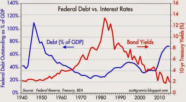
The federal deficit has now shrunk to a size that is manageable, because—at the current level of interest rates—the burden of the federal debt (i.e., total debt relative to GDP) is no longer increasing. Even in a rising interest rate scenario, the increase in the federal debt burden would not likely prove to be exponential, given how relatively small the deficit is today.

As the chart above shows, the Obama administration has overseen the largest post-war increase in the federal debt burden of any administration in history. Thank goodness it is no longer increasing. (Red bars in the chart signify that the debt burden increased over the presidential term, while green bars signify the debt burden fell.) There is hope for the future.
Abrazos,
PD1: Y mal, según quién lo explique:
Most people that discuss the "economic collapse" focus on what is coming in the future. And without a doubt, we are on the verge of some incredibly hard times. But what often gets neglected is the immense permanent damage that has been done to the U.S. economy by the long-term economic collapse that we are already experiencing. In this article I am going to share with you 12 economic charts that show that we are in much, much worse shape than we were five or ten years ago. The long-term problems that are eating away at the foundations of our economy like cancer have not been fixed. In fact, many of them continue to get even worse year after year. But because unprecedented levels of government debt and reckless money printing by the Federal Reserve have bought us a very short window of relative stability, most Americans don't seem too concerned about our long-term problems.
They seem to have faith that our "leaders" will be able to find a way to muddle through whatever challenges are ahead. Hopefully this article will be a wake up call. The last major wave of the economic collapse did a colossal amount of damage to our economic foundations, and now the next major wave of the economic collapse is rapidly approaching.
#1 Employment
The mainstream media is constantly telling us about the "employment recovery" that is happening in the United States, but the truth is that it is just an illusion. As the chart below demonstrates, just prior to the last recession about 63 percent of all working age Americans had a job. During the last wave of the economic collapse, that number dropped to below 59 percent and stayed there for a very long time. In the past few months we have finally seen the employment-population ratio tick back up to 59 percent, but we are still far, far below where we used to be. To call the tiny little bump at the end of this chart a "recovery" is really an insult to our intelligence...

#2 The Labor Force Participation Rate
The percentage of Americans that are either employed or currently looking for a job started to fall during the last recession and it has not stopped falling since then. The labor force participation rate has now fallen to a 36 year low, and this is a sign of a very, very sick economy...

#3 The Inactivity Rate For Men In Their Prime Years
Some blame the decline in the labor force participation rate on the aging of our population. But it isn't just elderly people that are dropping out of the labor force. In fact, the inactivity rate for men in their prime working years (25 to 54) continues to rise and is now at the highest level that has ever been recorded...

#4 Manufacturing Employees
Once upon a time in America, anyone that was reliable and willing to work hard could easily find a manufacturing job somewhere. But we have stood by and allowed millions upon millions of good paying manufacturing jobs to be shipped out of the country, and now many of our formerly great manufacturing cities have been transformed into ghost towns. Over the past few years, there has been a slight "recovery", but we are still well below where we were at just previous to the last recession...

#5 Our Current Account Balance
As a nation, we buy far more from the rest of the world than they buy from us. In other words, we perpetually consume far more wealth than we produce. This is a recipe for national economic suicide. Our current account balance soared to obscene levels just prior to the last recession, and now we have almost gotten back to those levels...

#6 Existing Home Sales
Our economy has never fully recovered from the housing crash of 2007-2008. As you can see from the chart below, the number of existing home sales is still far below the level that we hit back in 2006. At this point we are just getting back to the level we were at in 2000, but our population today is far larger than it was back then...

#7 New Home Sales
Things are even more dramatic when you look at new home sales. This is an industry that have been absolutely emasculated. The number of new home sales in the United States is just a little more than half of what it was back in 2000, and it isn't even worth comparing to what we experienced during the peak of 2006.

#8 The Monetary Base
In a desperate attempt to get the economy going again, the Federal Reserve has been wildly printing money. It has been so reckless that it is hard to put it into words. When I look at this chart, the phrase "Weimar Republic" comes to mind...

#9 Food Inflation
Thankfully, much of the money that the Federal Reserve has been injecting into the system has not made it into the real economy. But enough of it has gotten into the system to force food prices significantly higher. For example, my wife went to the store today and paid just a shade under 10 bucks for just four pieces of chicken. And as you can see from the chart below, food prices have been steadily going up in America for a very long time...

#10 The Velocity Of Money
One of the reasons why we have not seen even more inflation is because the velocity of money is extraordinarily low. In general, when an economy is healthy money tends to flow through the system rapidly. People are buying and selling and money changes hands frequently. But when an economy is sick, money tends to stagnate. And that is exactly what is happening in the United States right now. In fact, at this point the velocity of the M2 money stock has dropped to the lowest level ever recorded...

#11 The National Debt
As our economic fundamentals have deteriorated, our politicians have attempted to prop up our standard of living by borrowing from the future. The U.S. national debt is on pace to approximately double during the Obama years, and it increased by more than a trillion dollars in fiscal year 2014 alone. Despite assurances that "the deficit is under control", the federal government borrows about a trillion dollars a year to fund new spending in addition to borrowing about 7 trillion dollars to pay off old debt that is coming due. What we are doing to future generations of Americans is absolutely criminal, and it is just a matter of time before this Ponzi scheme totally collapses...

#12 Total Debt
Of course it is not just the federal government that is gorging on debt. When you add up all forms of debt in our society (government, business, consumer, etc.) it comes to a grand total of more than 57 trillion dollars. This total has more than doubled since the year 2000...

If you know anyone that believes that we are in good economic shape, just show them these charts.
The numbers do not lie. Our economy is sick and it is getting sicker by the day.
And of course the next major financial crisis could strike at any time. U.S. stocks just experienced their worst week in three years, and if cases of Ebola start popping up around the country the fear that would cause could collapse our economy all by itself.
The debt-fueled prosperity that we are enjoying today is not real. We are living on the fumes of our past, and every single day our long-term problems get even worse.
Anyone with half a brain should be able to see what is coming.
PD2: Un matiz adicional que no debemos pasar por alto ya que deriva en la futura paridad euro/dólar, los diferenciales de inflación entre ambos bloques. Tenemos los mismos tipos de interés, cero pelotero, pero la inflación es algo diferente:

Esos estímulos estadounidenses han permitido que su PIB sea mayor, que el paro aparentemente esté mejor, pero la bola de papelitos habrá que devolverlos…
Y el ORO haciendo la figura de camello vomitando… puajjj

No, el oro no ha sido refugio alguno. Me he cansado de repetirlo en estas líneas miles de veces. En momentos críticos, como los actuales, donde no sabemos qué va a pasar con las economías grandes, tira hacia abajo…

No, no es una burbuja, no…
PD4: Hay un creciente malestar con el estilo de Mario Dragui como Gobernador del BCE: http://uk.reuters.com/article/2014/11/04/uk-ecb-governors-idUKKBN0IO1H020141104 Da la sensación de que ya no sirven esas palabras que haré todo lo que esté en mi alcance… Cada vez menos más inacción entre los gobiernos de la UE, nadie quiere seguir la pauta marcada por Alemania de reformas y de recortes de gastos. Esta semana su ministro de Economía pedía que se hicieran más reformas, y que había que hacer más unión política, dado el desaguisado que hacen lso distintos países, que no siguen la estela germana… Y mientras, Dragui diciendo sandeces, cuando la realidad es que la UE está muy paradita, muy tiesa:

Y la Comisión Europea nos afea la foto a los españoles. Pero la foto completa, la que más duele es ésta, contando que seguimos gastando mucho más de lo que ingresamos que lo dejamos para que lo pague la siguiente generación:

PD5: Este verano pasado me he sorprendido de ver que los padres usan el pantalón corto de los niños y que los chicos no desean llevar el pantalón largo de los padres, como antes queríamos todos... Comodidad, mucha comodidad... ¡Ay de esos niquis llenos de carteles de publicidad que demuestran poderío...! ¡Qué memez, qué presunción! Nos quejamos de que los chicos tienen una moda rara y les copiamos, vamos vestidos como adefesios… ¿Dónde está esa elegancia natural que debemos tener los padres? Inculquemos valores…
Casi me troncho con esta foto de esta madre. ¿Descuidada? ¿Dónde tendrá puesta su cabeza para que se le caiga el bebe?

Valores, eduquemos a los hijos en valores, que si no a nuestros nietos les pasará esto, se irán mustiando…